s
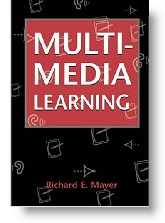
Mayer and his colleagues conducted numerous experiments and studies into how we learn best through-out the 90’s. The result of their efforts was the landmark book Multimedia Learning.
Following are some key conclusions and principals from his work to guide your multimedia development, including your webinar presentations.
Multimedia Works!
People do learn better with words and images, versus words alone.
Bottom Line: Ditch the conference calls, go online for greater effectiveness.
Redundancy Principal
We comprehend explanations better when words are presented as verbal narration alone, versus both verbally and as on-screen text.
Bottom Line: Don’t read you slides – if they are text heavy use them as notes and a handout and put relevant graphics on your slide.
Segmentation Principal
We learn better when information is presented in bite-sized chunks.
Bottom Line: Break your content into clearly defined segments, like chapters of a book.
Signaling Principal
People learn better when information is presented with clear outlines and headings.
Bottom Line: Agenda/outline slides and progress indicators/sign-post slides do help your audience. Slide titles matter too.
Personalization Principal:
We learn better when information is presented in a conversational style rather than a formal one.
Bottom Line: This theme is why we like to record your company’s thought-leaders and subject-matter experts, rather than produce a canned, professional narrative. Your presentations are naturally the most authentic and genuine. For presenters, it means you should practice your presentation so that you can simply use notes to guide you. You already know the subject matter. Being comfortable with the presentation structure allows your expertise and enthusiasm for the subject to come through naturally.
Spatial Contiguity Principal
We learn better when related text and images are placed next to each other.
Bottom Line: Don’t make your audience guess which images and titles go together, put them next to each other.
Coherence Principal
We learn better when any extraneous information is removed from a slide.
Bottom Line: If it isn’t critical to your point, delete it. I know some presentation experts even recommend ditching the ubiquitous logo, tagline, and date information from your footer since it is superfluous to your point.
Modality Principal
We learn better from animation with audio narration than from animation and text captions.
Bottom Line: We need to engage both the audio and visual “channels” to the brain. Voice narration with your images is the best way to go.
Temporal Contiguity Principal
We learn better when narration and animation are synchronized versus asynchronous.
Bottom Line: You want your narration and animation to reinforce one another. Animations or screen motion need to happen in sync with what you are describing. This is particularly important for demonstrations and takes some practice to do correctly.
Individual Differences Principal
Each of us will interpret a presentation uniquely based on prior knowledge, visual literacy, and spacial aptitude.
Bottom Line: We each learn a little differently. It is important to consider your audience profile when creating the presentation, use examples and stories to clarify your points, and gather feedback from your audience whenever possible.
You can learn more about Richard Mayer and his research here.
Leave a Reply
You must be logged in to post a comment.